Site Map Close
Korea Mcnulty Site Map
-
Introduction
-
Business Area
-
Brand
-
Investment
-
PR Center
-
Recruitment
- Introduction of Company Greetings of CEO Philosophy of Management History Introduction of CI Directions
- Coffee Business Pharmaceutical Business Restaurant & Education Business Health Functional Food, New Business
- Mcnulty iBrew Coffee with Happiness Origin ALE JANDRO
- Disclosure Information Stock Information Financial Information IR Archive
- Notices Press Release Archive
- Corporate Culture Desired Employee
 Introduction of Company
Company Bringing Happiness
Company Thinking Health
Introduction of Company
- Introduction of Mcnulty
- Greetings of CEO
- Philosophy of Management
- History
- Introduction of CI
- Directions
-
- Introduction of CI
- HOME | Introduction of Company | Introduction of CI
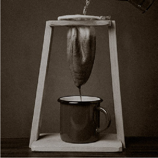
Symbolic Motif

-
The symbol of McNulty Korea represents our commitment to combining tradition and modernity in the coffee industry.
The design is inspired by the Chorreador, a revered coffee brewing tool in Costa Rican culture. The "M" in our name symbolizes the Chorreador, while the "C" represents the coffee itself and the environments in which it is consumed. Our symbol embodies our dedication to providing high-quality coffee products and experiences that align with the contemporary values of health and wellness. It is a representation of our commitment to preserving the cultural heritage of coffee while embracing the autonomous lifestyles of today's consumers.
Corporate identity
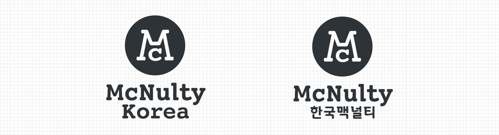 At McNulty Korea, our logo is a critical component of our brand identity and serves as the primary visual representation of our company. We take great care to maintain the integrity of our logo and ensure that it is not distorted in any way. To maintain the logo's proportion, we adjust the size of the image in direct proportion when using it.
Our logo reflects our commitment to innovation and modernizing the traditional coffee industry. The typography used in our logo is a contemporary interpretation of analog typefaces, embodying McNulty's ethos of constant evolution. Additionally, our Korean logotype has been specifically designed to enhance the readability of our logo and reinforce our brand identity.AI Download download PNG Download download
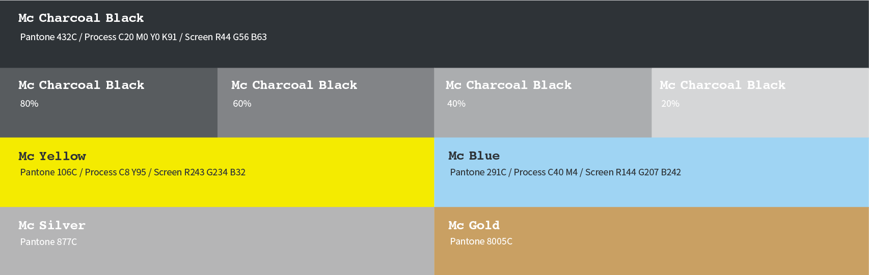
Color
At McNulty, our brand color "Mc Charcoal Black" is an integral part of our identity. The color represents the image of roasted coffee beans and the sophistication of urban living. With its elegant and understated appearance, black conveys a confident and professional image, reflecting the essence of the McNulty brand. Accent colors, including Mc Yellow and Mc Blue, are also available to complement our primary brand color.
-
Privacy Policy Statement | Rejection of Unauthorized E-mail Address Collection | Site Map Site Map | Contact Us |
 한글
[Head Office/ Plant/ Research Center] 42, Yeonamyulgeum-ro Seonghwan-eup, Seobuk-gu, Cheonan-si, Chungcheongnam-do, S. Korea / TEL. 031) 376-1383 / FAX. 031) 376-1350
한글
[Head Office/ Plant/ Research Center] 42, Yeonamyulgeum-ro Seonghwan-eup, Seobuk-gu, Cheonan-si, Chungcheongnam-do, S. Korea / TEL. 031) 376-1383 / FAX. 031) 376-1350
[Seoul Office] Mcnulty Bldg. 152, Yeonhui-ro, Seodaemun-gu, Seoul, S. Korea / TEL. 02) 332-3226 / FAX. 02) 332-1356
Copyright (c) Korea Mcnulty. All rights reserved. -


-